|
The Making of EZ-NetAdvantage!™
|
|
|
|
I have received many requests to know how EZ-NetAdvantage!™ got its look. There are a lot of things involved in making a site like this, but I will cover what I consider to be the most important. This process should also help you understand the steps involved in developing a site.
The first step in developing any successful site is to determine who the audience is and what the objective of the site is going to be. In this case, the audience was EZ-NetTools™ resellers (that's you). The objective was to inform & inspire.
With that in mind, I set about doing a little research. I had never created a site with so much content before, and I had some concerns about how to organize all that information. I first looked at some of the search engines. I was especially impressed with Lycos. Their home page is 600 pixels wide (just like most EZ-NetTools™ sites), but they can still pack a lot of information in there. I liked their layout and colors, too. I also checked out other e-zines. Glass Dog is a great site (again, 600 pixels wide) with lots of information and a very simple and elegant design.
After I had a few ideas in mind, I set about making some sketches. It is much more effective to make a rough sketch of a project and then create it in EZ-PageBuilder™ than to go directly to EZ-PageBuilder™.
|
|
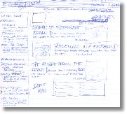
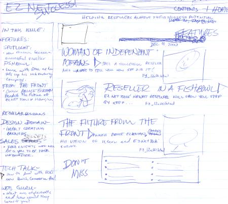
To the right is the original sketch I made of the e-zine. Click to see an expanded view of it. Unfortunately, the name EZ-NetSuccess was taken, but the rest of it is largely the way the magazine ended up. Remember, this sketch was made well before I ever touched a computer.
The next step was to determine the colors I wanted to use. I decided to
make a very simple draft of the magazine online so I could experiment with color combinations.
|
|
|
Click here to see the mock up that I made, and the colors that I chose. You'll note that they are in fact the colors that wound up in the e-zine.
Stylesheets
The e-zine project was a little different, in that I knew I wouldn't have final say in its look. Bruce Eckman and Kip Nield gave me a lot of liberty, but they would be the ones to give me the thumbs up or thumbs down on the final product. Also, when I was done, I would have to manage hundreds of pages. What if I needed to make a change? What if I wanted to change the look? I wouldn't want to have to start from scratch or edit all of those pages! With that in mind, I chose to use Cascading Style Sheets (CSS) to allow me to make global changes to the colors, tables, text, etc., by only changing one CSS document. At some point in the future, Tech Techniques will have an article that talks more about CSS, but I learned almost everything I know about it from Glassdog.com. If you would like to view my CSS file (default1.css), click here.
With this level of planning, I had a clear vision of what I wanted the final outcome to look like. I was then able to figure out how to make the site look the way I wanted it to. One of the first things I needed to do was create the header. I wanted the header to blend into the beige background color, so I made the bottom half of the header the same beige color that I planned to use for the main background that you see in the sidebar.
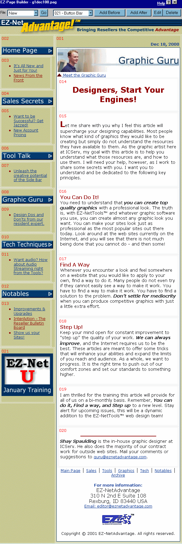
The next major element to be created was the sidebar. In my graphic software, I created the buttons that serve as headers for the various departments (graphic guru, sales secrets, etc.). I uploaded the buttons and added them into separate Button Bar Blocks in the sidebar. Then, I put in Bulleted Text Blocks underneath each button for the description of the recent articles from those sections. Under More Options, I set the sidebar width in pixels to 170 and spacing between fields to 0. Table width was set to 430 in global information. Click here to see a screenshot of the page in EZ-PageBuilder™.
The next step in creating the look of EZ-NetAdvantage!™ was to figure out how to put the beige background behind the sidebar and body. This turned out to be easier than I thought. I merely opened up an HTML table tag with a beige background by putting the following in the Header section of More Options. Note that the class="maintbl" attribute means that the table is getting some attributes (in this case background color) from the CSS file.
Header:
I then had to close the table by putting the following in the Footer section of More Options.
Footer:
With this done, I needed to put a white background behind the body. This would give a look and feel more akin to a magazine while keeping the text as easy to read as possible. That required an HTML block.
This code opens a table with a white background (class="bodtbl") that contains all the text. The white background table is closed in the Footer of More Options so that the information at the bottom of the page will be included in the white table.
In my sketch, I had determined that each page would have a sub-header graphic at the top of the white page. I decided that each department would have a person that served as the "expert" and each expert's photo would appear in their department's sub-header graphic to humanize the magazine. I made those sub-headers using photos, stock art, and Photo Impact. All of the supporting graphics in the body of the ezine are formatted using Photo Impact.
From there, I had to decide on the fonts that would be used. Since it's the default font in the tools, almost every EZ-NetTools™ site that I have seen uses Times New Roman as the primary font. To give the e-zine a more contemporary look and to show that other fonts could be used, I vowed not to use anything resembling Times New Roman in the e-zine. Depending on your computer's configuration, you view EZ-NetAdvantage!™ in Geneva, Verdana, Arial, Helvetica, or the Sans-Serif font. Again, with the intention of making the site easy to change, I established all of the various font types that I would use (header, body, body emphasized, sub-header, etc.) in the style sheet. The large red letter that begins each article is class "bod3" from the style sheet. The regular body text is class "bod1" from the style sheet. To create the first word, I type the following in a text block in EZ-PageBuilder™.
This should give you a good idea about what it took to create EZ-NetAdvantage!™. As you can see, the main elements that contribute to its unique look are the graphics and the sidebar configuration. The style sheet is used almost exclusively to make it so I could make changes globally and are mostly unnecessary for a regular site that doesn't change the complete look as often.
Please let me know what other questions you have about the magazine and what other techniques that I can describe for you in this department.
|
|
|
