|
Enhancements Made to Four EZ-PageBuilder Blocks
|
|
|
Introduction Today we have made some enhancements to four EZ-Pagebuilder blocks: Simple Text, Button Bar, Layout Manager, and Table. As a result of these enhancements, it will be easier to create some nice effects in a much simpler way. These enhancements will be in the advanced feature section of each block and are optional. Simple Text Block When you work with the Simple Text Block you will notice many more options in the advanced section. You may even wonder if the label “Simple Text” block is still appropriate. Remember that you can still just type in text. The new features are described and demonstrated below. Each of the following paragraphs are made with just one Simple Text block.
|
|
|
Background color. You can now specify the background color. The area to be colored is determined by several factors such as the Padding you have specified and the boundaries of the section of the page. For example this width of this block is determined by the parent layout manager. The spaces on the left and right are determined by the cell padding of the parent layout manager.
|
|
|
Background image. You can now specify a background image to go behind the text.As you can see from this paragraph, this feature can provide some interesting effects. Remember that the image is a background image so that is will only fill in the area of the Simple Text Block and will replicate if the image is smaller than the block area. The background image for this Simple Text block is just one pixel high but replicated down to achieve the effect of a fade.
|
|
|
Cell padding. Using cell padding you can expand the area included in the Simple text block in all four directions, above, left, right, and below. You can see by the background image, the area that this Simple Text block defines.
|
|
|
Borders. You can specify a variety of borders that go around a Simple Text block. You can specify the size, the color, the type, and where the border will go.
|
|
|
Button Bar You can now specify the spacing between the buttons. Previously, the spacing was predetermined to the default for HTML. Probably the biggest advantage with this change is that now you can specify no space between the buttons. If you expand your mind beyond just buttons to images and graphics, you now have a way to splice together a number of images in a very simple way. The Button bar can now become a building block for constructing more complex, graphically oriented web pages. We have also added a feature to make the graphics stack vertically as well without a layout manager.
|
|
|
Layout manager. In the layout manager you can now specify a background image for the entire Layout Manager Block. Previously, you could only specify a background image for each section of the Layout Manager. You can also specify the orientation of the graphic within the Layout manager. The gradient shading on the right side of this page was created by following specification in the primary layout manager for this page. 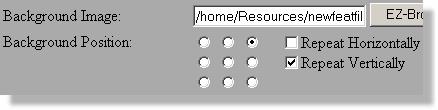
|
|
|
Table Block The use of the table block has been limited because of the amount of text that can be put into each cell and by the ability to format the text within each cell. Many of those limitation have been removed with this enhancement.
|
|
|
Enhancement
|
Description
|
|
More text
|
You can now add several thousand characters into each cell, enough to contain some HTML code.
|
|
Column alignment
|
You can now specify a separate column alignment for each column. Notice this column is right aligned while the other is left aligned.
|
|
Cell Padding
|
You can now specify cell padding that will create a pleasing space between your text and the border
|
|
Background colors
|
You can specify background colors for three areas, the table, the heading, and the cells. This table demonstrates all three.
|
|
Column width
|
You can specify the width of each column in either pixels or as a percentage of the available space.
|
|
|
|