
EZ-PageBuilder Table
You get to this function from the EZ-PageBuilder main menu. If you are on the first screen, you must leave this function by pressing the Next button at the bottom of the block (if you like the block and want to keep it) or by using the 'X' terminate block in the upper right corner of the block (if you want to abandon your work on this block.) On the second screen, you leave this function by pressing the Submit button at the bottom of the block (if you like the block and want to keep it).
Color handling in general: There are several fields on this page that allow you to specify the colors. All these fields work the same way. You may select any color by name that you want for the field. You can see a table that shows the colors and their names by pressing the button labeled View Color Table. To exit this option, use the back button on your browser. Adjacent to each field is a second field labeled 'Other Color'. This may show the current value of the field adjacent to it. Disregard the information in this field and do not attempt to change it
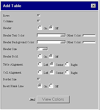
 Rows:
Note that you cannot change the dimensions of a table once it becomes part
of your page. Since the number of rows can only be specified when you are
adding a table, this field does not appear in EDIT mode. The table may
have between 1 and 15 rows.
Rows:
Note that you cannot change the dimensions of a table once it becomes part
of your page. Since the number of rows can only be specified when you are
adding a table, this field does not appear in EDIT mode. The table may
have between 1 and 15 rows.
Columns:
Note that you cannot change the dimensions of a table once it becomes part
of your page. Since the number of columns can only be specified when you
are adding a table, this field does not appear in EDIT mode. The table
may have between 1 and 15 columns.
Header
(On / Off): If you want to use the first row of the table as a header,
turn this button on.
Header
Text Color / Other Color: Use this option to specify the color of the
text in the first row of the table. See general
notes on color handling. Note that you may enter HTML in this block
to control the type face and
spacing
Header
Background Color / Other Color: Use this option to specify the
color of the background of the first row of the table. See general
notes on color handling.
Header
Size: This field allows you to specify the size of the type of the
first row of the table: 7 = huge, 1= small.
Header
Bold (On / Off): If you want the title to be displayed in bold type,
turn this button on.
Table
Alignment (Left / Center / Right): Specify how you want the table to
be aligned within the block.
Cell
Alignment (Left / Center / Right): Specify how you want the text to
be aligned within each cell.
Border
Size: Use this feature if you want a border to appear around the image.
Use the down arrow adjacent to the block to select a border width. The
size may range from 0 to 50 pixels (picture elements) wide.
Insert
Blank Line (On / Off): If you want
to have an extra blank line between this block and the next one, turn this
button on.
Next/
Data Display: If you are adding a table, you will need to click the
Next button to go to the page where you enter data in a table. If you are
editing a table, you will be shown the table contents and given the opportunity
to change them without having to load another screen. Note that you may
enter HTML in the data fields block to
control the type face and spacing
When you are finished, press the button labeled Submit.