|
|
|
|
Configuring your Layout Manager Block
|
|
Now that you've created a new basic layout manager block, you're ready to configure your block. The purpose of this section is to explain in detail each configuration option for the layout manager block. The configuration screen will appear when you first create the layout manager. If you want to configure a layout manager block that is already on the page, click on that block's edit icon ( ). ).
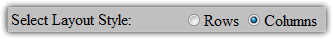
Layout Style
You've already seen this one. Layout style allows you to choose whether the layout manager's blocks are displayed on top of each other (rows) or side-by-side (columns).
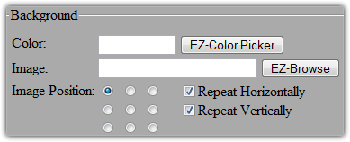
Background
This feature allows you to set and configure a background for the entire layout manager block. This background will appear behind all of the blocks contained in your layout manager. You can use a color (click EZ-ColorPicker) or an Image (click EZ-Browse). If you choose an image, you can also select where the background image will be and whether it tiles horizontally and vertically.
Padding
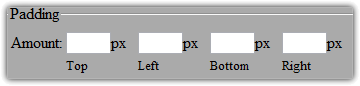
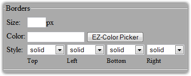
Padding specifies the amount of space between the contents of the layout manager (the contained blocks) and its borders. If the padding amounts are empty you will get the browser default amounts. The image below illustrates how padding is displayed. 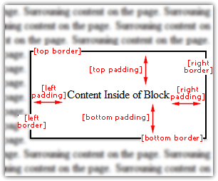 BordersBorders are simply an outline surrounding the block. First, choose the border size (width in pixels) and . Lastly, you can choose the border style. The chart below illustrates each of the different types of borders you have to choose from. For example, the vertical lines on either side of this column on this page were created configuring the left and right borders to be one pixel wide and black. 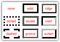 Block Options
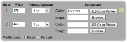
 allow you to modify the appearance of the blocks contained within the layout. As you can see in the image above, there is a row listed here for each block that is currently inside. Note that if you are creating a new layout, this section will be hidden because you do not yet have any blocks inside the layout manager yet. This will only be visible when editing an existing layout manager that already has blocks inside of it. For each block you have three options: - Width - How wide this block is within the layout. Note that if your layout style is set to rows, this option has no effect. Do not include the measurement in this box (%, px, etc...).
- Vertical Alignment - If one block is smaller than another, should it be lined up at the top, middle, or bottom of the larger block? Like width, this option also only applies to column layouts.
- Background - Either a color or an Image. Use EZ-ColorPicker for color or EZ-Browse to choose an image for the block background.
If you specify widths for your blocks, you need to select which measurement to use as well. Choose either pixels or percentage. If you choose percentage, the sum of all the blocks' widths should add up to 100. 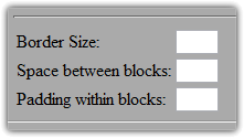 You also have the option of applying borders and spacing to each block. If you set border size, an outset border (see the border chart above) will be added around each block in the layout. Space between blocks will add clear space between each blocks. Padding within blocks will add space between the block contents and its border. For example, on this page the "Padding within blocks" is set to 9, thus creating a pleasing space between the virtical lines and the text.
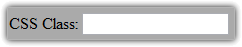
CSS Class
This options allows advanced users to assign this layout to a CSS (Cascading Style Sheets) class. They can then use CSS code in the head section of the web page (in Page Options) to have better control over the appearance of the layout. For more information about CSS, visit the W3schools CSS Tutorial.
Insert Blank Line
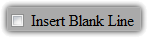
If you check this box, an extra line of space will be added to the bottom of this block so that it is not too close to the block underneath it. This is a quick trick that will save you the effort of creating a spacer block.
|
|
|
|
|